
SeekingGood
UNIVERSITY OF MICHIGAN - COURSERA UX DESIGN CAPSTONE
user needs research | information architecture | wireframe + prototype design
MY ROLE
Researcher
UX Designer
UI Designer
TOOLS USED
Figma
Google Slides
Lucidchart
TIMELINE
Sept 2022 - Nov 2022
-
Sept - user research
-
Oct - functions design & wireframing
-
Nov - micro-testing & prototyping
As the capstone project of my Coursera UX course, I created an app to improve the efficiency and UX of a process that has an effect on the community.
Having worked with nonprofit clients as part of my marketing career, I became interested in using design to innovate growth for nonprofits and social-impact companies.
What are ways to make the gift giving process for donors easier? What things incentivize vs deter donors while in the donation process? These are some of the questions I asked in order to determine the direction and functions of my project.
UNDERSTANDING THE PROBLEM
A need to organize nonprofits needs and optimize donor research
PERSONAL EXPERIENCE
From a donor perspective, I have also often been involved in fundraising projects as part of campus organizations. A time consuming challenge involves researching and finding a reputable charity that aligns with the organization’s values that the fundraising can support.
MARKETING EXPERIENCE
From an acquisition marketing lens, I know that a struggle that some nonprofits face in their revenue-generating process involves confusion or friction within the donation funnel. However, I wasn’t sure what elements would specifically encourage or discourage donors in the process of considering donation
RESEARCH PROCESS
I conducted interviews to better understand user pain points
Criteria for the interviewees include:
-
Donors who have similar intent as those who make purchases or want to make repeated purchases
-
Users with experience donating online, going through an online purchasing decision with careful consideration, or users with an intent to donate
I used the https://www.rescue.org/ and https://www.pcrf.net/ page to gauge the user needs for an effective donation funnel.
I interviewed 3 users in order to answer these questions:
What information and options on an ask for donation is the most optimized to encourage donations?
What kinds of friction do those thinking about donating encounter during the funnel process, and how should they be addressed?
What and how is the most productive way to engage with donors?
Finding patterns in donor experience with affinity boarding
Following the interview, I organized my findings and insights into affinity boards and personas.
KEY FINDINGS
Following the interview, I organized my findings and insights into affinity boards and personas.
-
Users think it would be helpful to have a management platform to handle financials, news, and updates for all donations.
-
Website information transparency is highly important in the decision to make a gift.
-
Personal connection to the cause, either through social media or in-person, is a strong motivator for giving. Timely updates on the fund or the cause donated to are also important feedback for donors.

PERSONAS


I researched competitors on the market to understand other solutions and unmet needs
Using the Google Play Store, I searched for apps related to donation or charity and found that there are currently no apps that provide the function of managing all donations and news updates in the same place.
Positives
-
Gamification makes donating fun and “addictive”
-
Users enjoy clean interface without a lot of ads
-
Users enjoy knowing that they’re making a difference in the world through their actions
The majority of apps are for single organizations, or struggle with bad UX design as mentioned in reviews.
However, an app for donating to world hunger called Share the Meal provided valuable insight to what users look for in a donation app.
Negatives/Needs
-
Some users are repelled by donating dollar amounts rather than material impact
-
Users don't like the lack of transparency to where the money is going
-
Options to donate to different projects is a hard decision
-
Some users want push notifications
HOW MIGHT WE...
How might we allow nonprofit donors to easily manage their monetary gifts and organizations?
GOAL
My goal is to create an online tool for frequent donors of nonprofits to be able to manage all of their monetary gifts and organizations in one platform. The app, called SeekingGood, will also provide timely updates to donors to update them on the impact that their donations have, and serve as a discovery tool for new users who are looking for a cause to donate to.
PRODUCT SOLUTIONS
Connecting user needs to app features
Needs
Solutions & Features
Feedback
Timely, consistent, and authentic updates from charities
Management
Detailed, easy to donate, secure donation options
Discoverability
Find charities and organizations for causes they want to donate to
Notification and Stories
News story notifications on missions and use of funds for each organization
Transparent Organization Details
Detailed descriptions of organization’s values, use of funds, reputation/certification, missions, and impact
Search and Share Functions
Social media/sharing function to share about different funds and organization mission stories
Search function to find reputable and reliable charities or recommendations based on past donations
DESIGN SOLUTIONS
Low fidelity wireframes allowed me to test and iterate on the designs
I created wireframes and layouts on Google Slides, incorporating features that users found important in research, such as sharing, news updates, and transparency in the impact that financial gifts would provide


Usability testing helped to identify areas of improvement
With two users, I conducted interactive usability tests to determine what components of the layout and UI can be made more intuitive and efficient.
User test goals:
-
Find out information on a nonprofit
-
See your current donation amounts and change it
-
Search for an organization and donate to it
I took notes on their comments and suggestions on a critical logging sheet documenting their performance on each goal.
At the end of the test, I conducted a brief questionnaire and calculated two scores based on the System Usability Scale (SUS).
Final SUS Scores
User Test 1 - 90/100
User Test 2 - 85/100

A product that connects donors with nonprofits and encourages contributions
FINAL PRODUCT
I created the final prototype using Figma. Feel free to interact with the entire prototype (including screens not included below) here.
Home Page & Stories
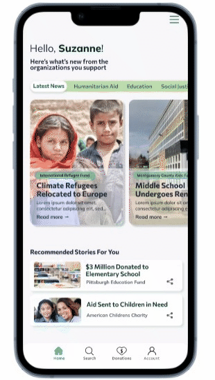
On the home page, users can easily see the newest updates and news stories on organizations that they are donating to.
Recommended Stories on the home page encourages users to read about other fund projects or organizations they may be interested in and provides exposure to similar causes.
Sharing is available on all stories to allow connection to social media.
The bell icon next to the organization allows users to opt into future updates and stories from that organization.
Search Results
Under the search tab, users can choose to search by either organization name or by cause.
Search results for "nature conservation" includes organizations and fund projects, and the the ability to sort and filter by either.
Each fund project or organization also displays the number of donors to allow for greater transparency for the user.
Organization Page & Donate
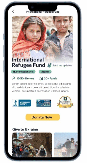
On clicking into an organization page, there is a clear description of the organization, including a list of accreditations that verify its legitimacy.
The page includes scrolling carousels of fund projects, as well as videos and recently updated news stories for users to get a sense of its impact.
Tabs at the bottom of the page allow users to browse through details on the organization's mission, vision, board, and financial details of how funds without overwhelming them on the main organization page.
Multiple options for donation amounts (and what the material impact is) allows users flexibility in giving.
Finally, call-to-actions for donation on the page encourages users to enter the donation funnel at multiple points.
REFLECTION
What I learned—
Completing an end-to-end project, from research to wireframing and prototyping, helped me to better understand the theory and concepts I learned in the Coursera course, and cemented my interest in UX design.
WHAT WENT WELL
-
I tried and combined a variety of research methods, including interviews and competitive research, in a way that helped me gain a better understanding of user donation needs from both primary and secondary sources.
-
I gained a proficiency in Figma as part of the final design process, and taught myself ways to use the interactive elements to make a live prototype
-
Putting the case study together on my portfolio helped me to think through the narrative story of my process: where to explain and elaborate, and how to show the dots connected between needs, solutions, and final design
WHAT CAN IMPROVE
-
In the future, I'd like to reach out to a wider population for research and interview. The users I interviewed were mostly young and had less experience in donation. Older users who donate more frequently would have helped to bring more well-rounded insights to my research.
-
I'd like to incorporate more considerations for accessibility in my design process, including options like changing screen size, read-aloud options.
-
I'd also like to create more details and interactions in my final prototype and allow for a more comprehensive testing opportunities after the high-fidelity designs.